
Layer Light Like a Pro: Soft, Sophisticated Ambience Everywhere
Start with the Three Layers
Ambient: The Quiet Backbone
Create a gentle base that lets your eyes relax and adapt smoothly between zones. Indirect light bounced off ceilings or upper walls softens edges and removes stark contrast. Warm color temperatures—often around 2700K to 3000K in living areas—encourage calm evenings. Aim for broad distribution rather than hotspots, and consider shielded fixtures or cove lighting to avoid glare. When this layer is even and forgiving, everything else above it can be subtle and truly elegant.
Task: Purpose with Poise
Where hands move and eyes focus, introduce brighter, closer light that remains comfortable and restrained. Under‑cabinet strips, swing‑arm lamps, or discreet track heads can deliver clarity at the surface without flooding the room. Keep beam spread controlled, and position light just ahead of the working area to minimize shadows. Around 300 to 500 lux is common for reading or food prep, yet dimmers let you fine‑tune when intensity feels pushy. Precision here prevents over‑lighting everywhere else.
Accent: Gentle Emphasis, Not Glare
Treat highlights as whispering spotlights, not interrogations. Aim for roughly a three‑to‑one contrast ratio between the feature and its surroundings, using tight beams around fifteen to thirty degrees for art or textured walls. Wall‑washers even out larger surfaces, while grazing enhances stone or brick depth. Keep source visibility low through baffles, snoots, or proper aiming angles. These touches guide attention across the room, creating sophisticated rhythm, nuanced depth, and that quietly curated feeling people remember.
Color, Warmth, and Control
Placement and Beams that Flatter
Ceilings That Disappear, Light That Remains
Use fewer, better‑aimed downlights rather than a grid. Choose narrower beams for art or tabletops and broader beams for general wash, then recess sources to cut glare. In low ceilings, favor indirect solutions like coves or perimeter slots to lift the room. Keep trims consistent in finish so the ceiling recedes. When fixtures vanish, the visual field relaxes and the room feels taller, calmer, and more refined, as if the air itself carried the illumination softly.
Walls as Canvases
Wash large walls to soften contrast and visually widen tight rooms. Place wall‑washers or adjustable tracks at the right setback so the gradient is gentle, not streaky. For texture—brick, fluting, linen wallpaper—grazing from a closer position can reveal depth without harsh sparkle. Alternate broad washes with quiet shadows to sculpt rhythm. The goal is to add volume, not drama for its own sake. When walls glow evenly, furniture silhouettes read elegantly and artwork breathes without strain.
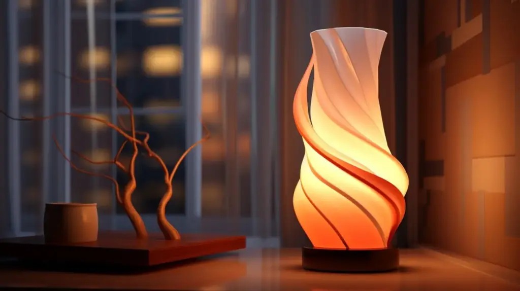
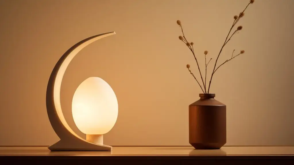
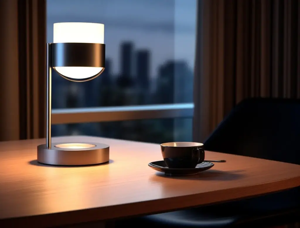
Movable Pieces that Finish the Composition
Table lamps, floor lamps, and picture lights are the finishing brushstrokes that fine‑tune softness. Use fabric shades, opal glass, or micro‑prismatic diffusers to spread light like butter rather than pinpoints. Stagger heights so light pools overlap and fade, reducing stark edges. A slender uplight behind a plant can lift corners beautifully. These portable elements adapt instantly to gatherings, reading, or quiet tea, ensuring the composition remains graceful as life changes hour by hour.
Materials, Reflectance, and Softness
Choosing Surfaces that Love Light
Aim for a balanced reflectance palette: lighter ceilings to boost indirect glow, mid‑tone walls for gentle diffusion, and slightly darker floors for grounding. Avoid extreme gloss near high angles where reflections sting eyes. Textured linens, limewash, and honed stone scatter highlights into a velvety field. Place darker accents where you want depth, not where they swallow precious lumens. When surfaces accept and relay light gracefully, rooms feel soft without dullness and bright without brittle glare.
Diffusers, Shades, and Lenses
The right diffuser transforms the same lamp into a calmer companion. Fabric shades warm and feather light. Opal glass evens hotspots. Micro‑prismatic lenses control brightness while keeping output efficient. Layer diffusion thoughtfully so edges hush rather than blur away important detail. Combine with dimmers for evening glow that feels human, intimate, and unhurried. Good diffusion encourages proximity—people lean in, talk longer, and notice textures and faces kindly lit, without feeling spotlit or washed out.
Mirrors, Artwork, and Subtle Sparkle
Use mirrors to bounce light deeper into a space, but angle them to avoid reflecting bare sources. Picture lights should reveal color without bleaching highlights; high CRI helps marbles, oils, and inks sing. Small metallic accents—brass, bronze, seeded glass—add twinkle in controlled doses, suggesting luxury without glare. Let sparkle sit within a bed of calm, never dominate it. This measured interplay of glow and glint delivers that refined, soft ambience people instinctively trust and enjoy.
Room-by-Room Layering Walkthroughs
{{SECTION_SUBTITLE}}
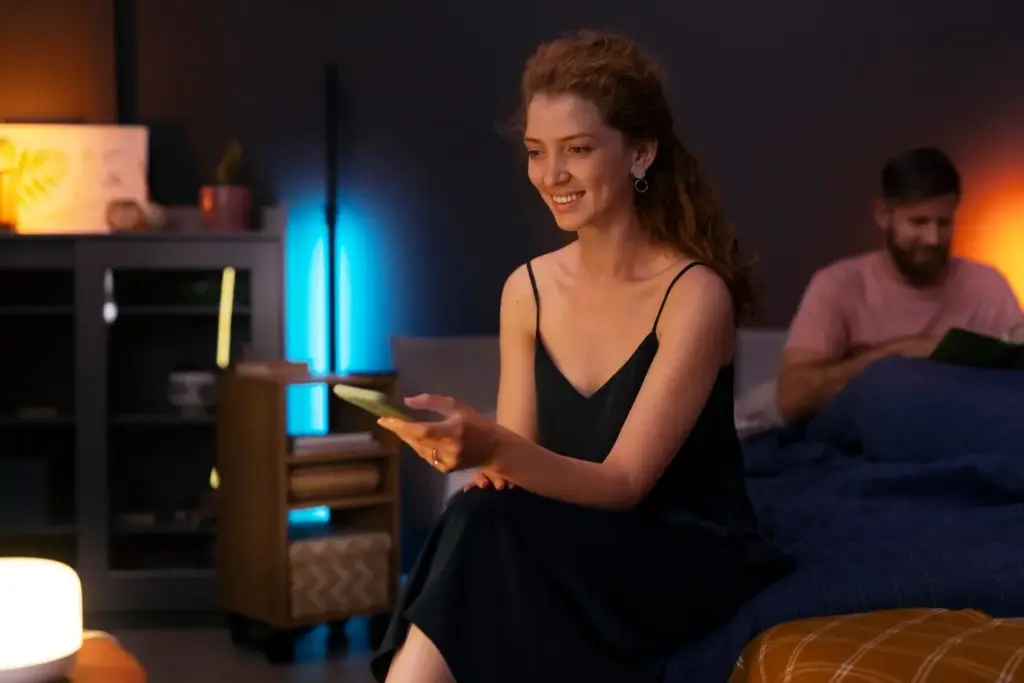
Living Room Evenings that Unwind
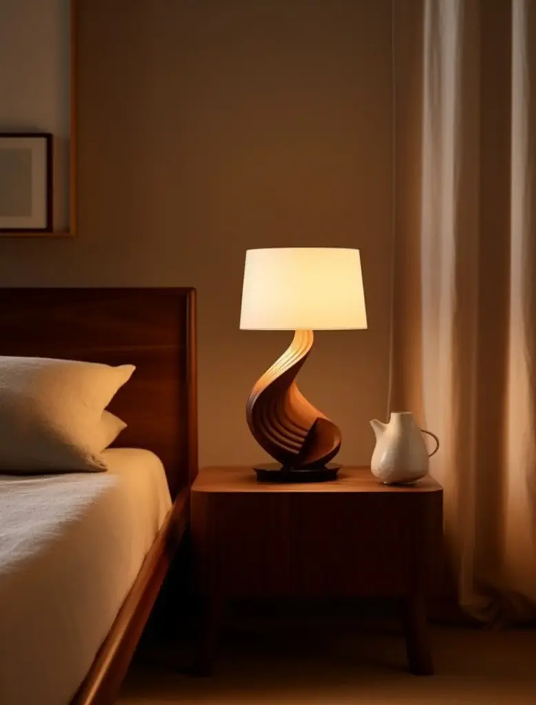
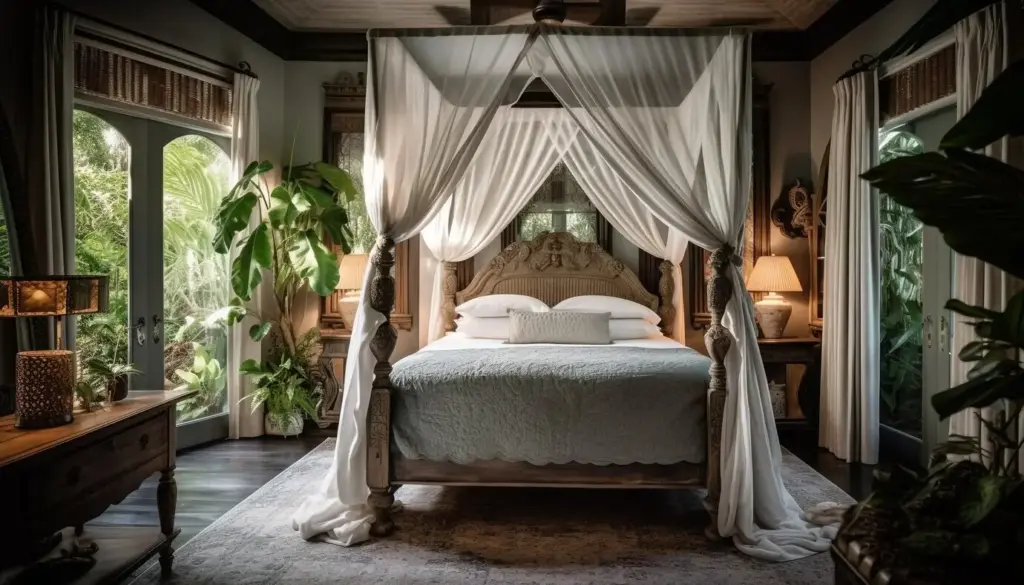
Bedrooms that Truly Exhale

All Rights Reserved.